Photobucket

related link

Monday, February 25, 2008

Clear Glass Material

In this tutorial, using 3dsmax, we will make a Clear (Transparent) Glass material and apply to some objects.


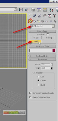
Start or Reset 3dsMax. If there is no minimum environment or surrounding objects around the glassy objects it will not make much sense for glass material. That means, the effects of glass material’s reflection/refraction etc. will be seen only there are some objects/environment around. So, we will make a simple room for our glass objects to be placed into. Choose Create > Geometry >AEC Extended > Wall.

Please note that “AEC Extended” is not available in 3dsmax’s previous versions (such as V5 etc.). I have used 3dsmax8 for this tutorial. However, you can make walls or room using other max object such as Box promitive.


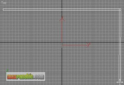
In the Top viewport, create a Wall like below.


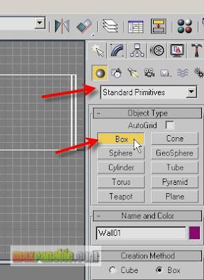
For making floor, choose Create > Geometry > Standard Primitives > Box.


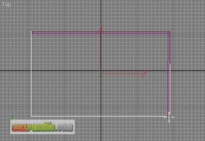
In the Top viewport, draw a box like below. The floor should have been placed at the ground zero level without any problem.


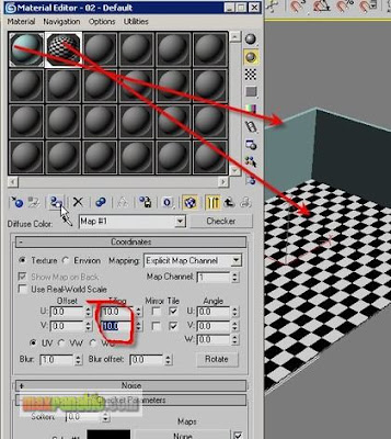
Apply a simple colour material to the wall and a Checker material to the floor. Adjust the number of Tiling of Checker as your wish.


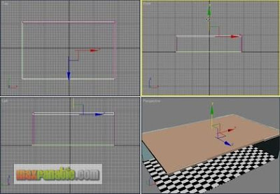
For ceiling, create another Box in the Top viewport. Then move it up in the Front viewport to place it in the proper height. Apply a white colour material to it.


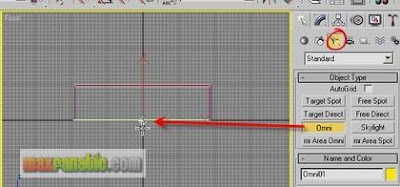
Create an “Omni” light as below.


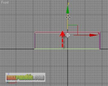
Then move up the light just below the ceiling so that it can illuminate the room.


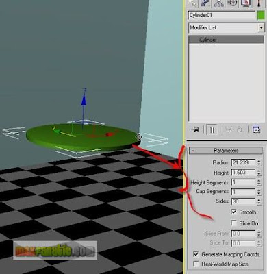
We will assign the Glass material to a glass, a bottle and a small tea table. For the table-top, make a cylinder with the parameters like below.


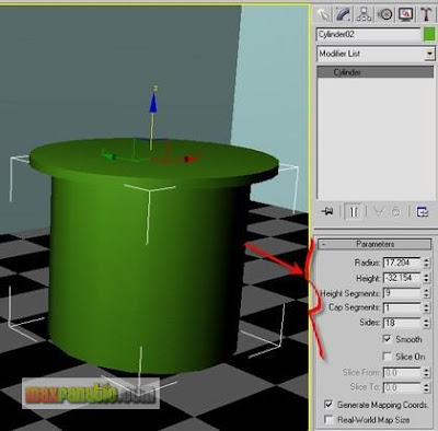
For the table-leg, clone this Cylinder and adjust its parameters like below.


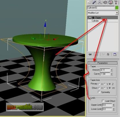
Add a “Taper” modifier to Cylinder02 and adjust its Amount and Curve value so that it gets a nice curvy shape to represent the leg of our glass-made tea-table.


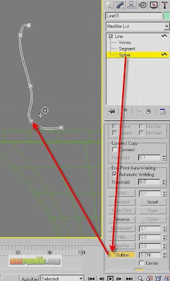
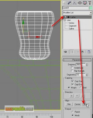
For Glass Mug, Choose Create > Shapes (Splines) > Line and draw a line to get the basic profile for the Glass Mug. Go to Modifier panel and enter its Spline sub-object. Using “Outline” command, make an offset of the line in the viewport by dragging the mouse pointer to a little right. See below.


Apply a “Lathe” modifier to it and choose “Max” in the Align group.


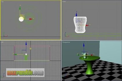
Move it to the proper place on the table-top.


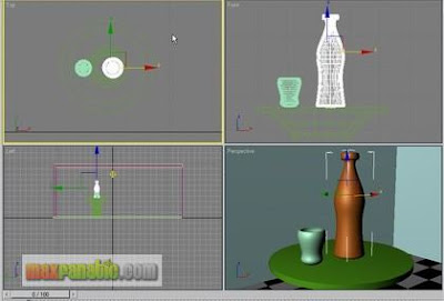
Again using Lathe technique or your preferred modeling technique, make a Bottle and place it beside the Mug.


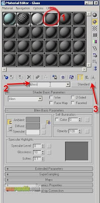
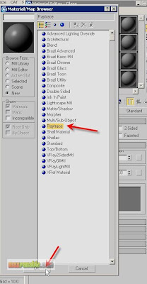
Open the Material Editor and choose an unused sample slot. Name it “Glass” (although it is not necessary to name a material it is useful in the big project’s files where there are many materials to be assigned to several objects for better recognition). Click the button lebeled “Standard”. We will change the base material type from Standard to Raytrace.


In the Material/Map Browser, choose Raytrace and then click OK.


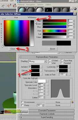
Click the Diffuse colour swatch under Raytrace Basic Parameters and then choose a solid Black colour. Close the colour selector option box. A black diffuse colour means here that a glass will have not its own colour.


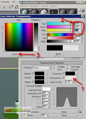
Then, choose a near white colour of RGB value of 230, 230, 230 as the Transparency colour. Assigning a near-whitish colour (bright grey) means that it is almost a 100% transparent material.


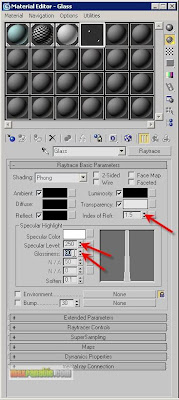
Set the Index of Refraction value = 1.5, Specular Level = 250 and Glossiness = 80. In the real world, the IOR of a Glass material is 1.5. Also, the specified Specular Level and Glossiness is reasonable to those of real world glasses while the Specular Colour of Raytrace material is set to White by default in 3dsmax.


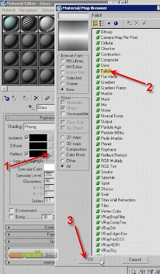
In case of glasses, there is also Reflection beside Refraction. We will now assign a Reflection type to the material. Click the Map button next to “Reflect”. Then choose “Falloff” in the Material/Map Browser and click OK.


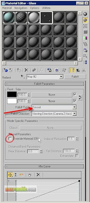
“Falloff” is a special type of mapping technique which defines the area of an object into two parts and distributes the map accordingly. Choose the Falloff Type = Fresnel. A “Fresnel” falloff distributes the map with the logic of Front and Side. In this material, the Reflection will be assigned most to the Side and least to the Front of the object. Because the Black reflect colour is assigned to Front and the White reflect colour is assigned to Side. Turn OFF “Override Material IOR”.


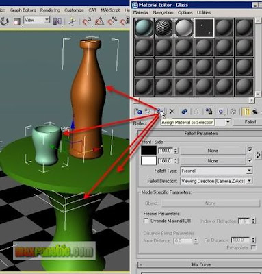
Select the Mug, the Bottle, the Table-top and the Table-leg and assign this glass material to these objects. Render.


Play with the parameters of the glass material and see the result. For example, you could make another Raytrace material for the table where you can set the Diffuse colour different such as blue etc. Also, play with the Falloff Type. You will see different results on different settings.


Read More......

Tip: Polar Snapping in Max and VIZ

To add Polar Snapping Mode to the Snaps toolbar:

1. Open the Snaps toolbar, if necessary. To do so, right-click an empty part of the main toolbar, such as the area directly below one of the drop-down lists, and choose Snaps.

2. Drag the right end of the toolbar to the right to make room for a new button.

3. Choose Customize menu > Customize User Interface.


4. This opens the Customize User Interface dialog.

5. On the dialog, click the Toolbars tab.

6. Scroll down the Actions list on the dialog to the Polar Snapping Mode item. You can jump to the P section by clicking any item in the list and then pressing P on the keyboard.

7. Drag the Polar Snapping Mode item from the list to the empty section of the Snaps toolbar. This adds the button to the toolbar.

8. Close the Customize User Interface dialog.

9. 3ds Max automatically saves the toolbar in its revised state and makes the new button a permanent part of the user interface.

To use Polar:

1. Turn on the Polar Snapping Mode button.

2. The button appears depressed.

3. Begin to draw a line spline.

4. An orange compass appears where you place the first point, along with a red number indicating the angle of the current line segment with the positive direction of the local X axis.

5. Move the mouse cursor around in the viewport.

6. The line jumps to specific angle increments from the X-axis, while the compass reading updates to show the current angle. You set the angle increment in the Grid And Snap Settings dialog > Options panel > General group, which you can access by right-clicking the Angle Snap Toggle button on the main toolbar.

7. Click to place the next vertex.

8. Repeat steps 3 and 4 until you're ready to complete the shape.

9. Do any of the following:

-To finish the shape at the most recent vertex without closing it, right-click anywhere.

-To finish the shape by closing it, position the mouse cursor close to the first point and then click. A small dialog opens asking if you want to close the spline; click Yes.

-To finish the shape by closing it while constraining the line to the polar snap, first position the mouse cursor close to the first point, press and hold Alt to constrain the mouse by both the previous point and the first point, and then click. This vertex is automatically placed at the current angle increment from the first point, so that you need only click the first point to close the shape.


Read More......

Thursday, February 7, 2008

BACK ONLINE

Ted Boardman tedb@tbmax.com http://www.tbmax.com

Perhaps some of you have wondered where I've been over the last few months (and some haven't I'm sure, but that's fine, too) and why I haven't been writing the column. While there are always ample excuses that I could be using, it's been primarily because of a very heavy travel schedule through the end of December and my 3ds max 7 Fundamentals book.

Any time I've had available for writing so far in 2005 had to be dedicated to getting the book finished. I'm pleased to them announced that I'm pretty much on schedule and only have a couple proofreading chores before it's ready to head off to the printers. I'm not entirely sure how long that process will take, but the book should be on the shelves in the US during the last two weeks in March.


The book, as indicated by its title, focuses on fundamental topics that will help new users of 3ds max 7 accomplish 75% of their work quickly and efficiently while leaving an editing trail that allows easy changes to be made in both modeling and materials.

There are 20 chapters with all new exercises in which the reader builds a small airstrip. The exercises range from exterior scenes with outbuildings, including a control tower, roadways, and, of course, an airplane, to interior scenes with photometric lighting and a couple of chapters on particle systems and special effects. Some new features of 3ds max 7, such as vertex paint as a modeling tool, Projection mapping, and Normal mapping with Render to Texture are introduced, as well.

One thing I'd like to mention that is off-topic, but may be of some interest to those of you who do any writing is that I'm now using Dragon Naturally Speaking www.ScanSoft.com

software to dictate much of what I had previously typed. While I'm a reasonably fast and accurate typist, I find that after two or three days of intense time on the keyboard, I'm just plain worn out. With the Dragon software, I can sit back in a much more relaxed position and just chatter away, something I'm reasonably good at, too. The software has performed very well, learning my manner of speaking and my New England accent quite quickly and handling the 3ds max 7 terminologies rather well. I can even do simple things in 3ds max 7 by voice commands, although I wouldn't want to have to make a living with those new skills.
A Production Checklist

There are a few default settings in both max and VIZ to do not always lend themselves to high productivity and are settings that in "the heat of battle" we don't often get around to changing, even though they could be slowing us down significantly.

I'll post a little bit of a checklist that everyone should go through in the early stages of each project. It would also be wise to apply these changes to current projects, or even recently completed projects, so that you have a good “before and after” comparison to judge their effectiveness.

Shadow optimization

Max quadtree depth.

I would have to say that if there is any single "trick" that I can introduce users to that will increase production the most it's the Raytraced shadow Max Quadtree Depth setting. A quadtree is the subdivision setting of a scene from a light's viewpoint used to test at the intersection of a light's rays with the scene's objects. If there are too many objects in the current quad it is subdivided until there are only a few objects per quad or until a maximum mathematical depth has been reached. The fewer objects per quad, the faster the shadow calculations are, at the expense of memory.

If you select a light in your scene with Raytraced shadows, and go to the Modify panel, Ray Traced Shadow Params rollout, you will see the Max Quadtree Depth setting is set to 7 by default, and this is seldom an ideal value for this setting. See Figure 1. The maximum setting amount is 10 and some users will say that you should use only 10. However, I recommend that you try both 8 and 9 to find the optimum value for your particular scene. Max Quadtree Depth must be sent individually for each light in your scene with Ray traced shadows, but is always worth the small amount of time it takes to test and change the values.


Figure 1: Setting the Max Quadtree Depth for Ray traced shadows greater than 7 can significantly decrease render time.

Attenuation

Lights in max and VIZ will shine to infinity by default and will try to calculate shadows for all objects within the beam of light. Lights that shine forever are not convincing, for one thing, but perhaps more importantly, they can waste computer resources. Lights in the real world attenuate, or decay, based on the Inverse Square law of physics; the strength of the light diminishes by 1/ distance squared from the light source.

In the Modify panel, Intensity/Color/Attenuation rollout, you can set the Decay to Inverse or Inverse Square and then adjust the Start range, a distance from the light source where the attenuation begins. This, of course, is not realistic, because in nature the decay always starts from the light source, not an arbitrary distance from it. As an alternative, I recommend using Far Attenuation where you set a Start range and an End range. The light has full intensity from the source to the Start range, attenuates in linear fashion from the Start range (tan lens) to the End range (brown lens), and has no affect beyond the End range. Figure 2.


Figure 2: Far Attenuation should be used for most lights in your scene.


This attenuation makes lighting look more convincing, but the big advantage lies in the fact that no shadows are calculated beyond the End range, resulting in potential productivity increases.

Raytrace Reflections Optimizations

Raytrace Reflection Attenuation

Raytrace reflections are another mathematical drain on computer resource that can often be optimized and, in some cases, enhance the quality of the reflections at the same time. In the real world reflections are simply light bouncing off surfaces and, as such, they must obey the same laws of physics that affects the behavior of any light. Raytrace reflections in 3ds max 7 also have attenuation setting similar to those in the lights.

The method I use for controlling Raytrace reflections is to leave the Raytrace map amount set to 100, then go to the Raytrace map level in the Material Editor and open the Attenuation rollout. There you will see a Falloff Type drop-down list, with options for Linear, Inverse Square, Exponential, and Custom attenuation types. While for Inverse Square option fits the real world physics model the best it is also mathematically intensive and won't decrease render time much, if any. I recommend using the Exponential type and setting the Ranges to get the look you want in your reflections. The Start range is where the reflection starts to attenuate from the reflecting surfaces in system units, usually inches in the US. Beyond the End range setting there is no reflection, thus saving computer resources and speeding rendering in many cases. The Exponent setting controls how quickly the reflection cut off occurs between the range settings. Figure 3.


Figure 3: Raytrace reflections can also have attenuation and the Exponential type is usually the most efficient.


Pixels beyond the End range will be replaced with the Background color or image by default, but you can also choose the Specify radio button and select a color that you want. For example, I often choose blue for metal materials to cause the reflections to fade out to a cool tone to make the metals seem harder. Finally, when the attenuation appears the way I want it in my rendered image, I go back and adjust the Reflection Amount to tone the reflections down where they are too bright, for example, where a wall meets a floor.

Global Maximum Depth Setting

There is also a global Raytrace reflection optimization in scenes that have a significant number of Raytrace reflection materials. If you go to the Rendering poll-down menu and choose Raytracer Settings to access the Raytracer tab of the Render Scene dialog, you will see a setting called Ray Depth Control, Maximum Depth. This sets the number of reflections within reflections in the default setting of 9 is usually much too high for most scenes. I recommend you set the Maximum Depth to 3. Figure 4.


Figure 4: A Maximum Depth setting of 3 is sufficient for most scenes


A specific case where the setting may need to be higher would be something like an elevator car with mirrored walls where you can see the reflections of the opposite walls reflections for many iterations, however, this is the exception rather than the rule. Again, if you set the Maximum Depth to 3 pixels beyond the third reflection will be replaced by the Background color, but you may also specify a color of your choosing.

Maxscript Optimizations

Garbage Collection.
Scenes will often take weeks to fully develop and are open and closed by several people may make many edits along the way. All this activity has a tendency to leave remnants of commands and objects in the file, which can slow production.

Entering gc() in the Maxscript listener window at the bottom left of the display, and pressing Enter can often purge the current file from much of this unnecessary data. Figure 5.


Figure 5: Garbage collection with Maxscript can reduce file sizes and make scenes more efficient.


Summary

By going through this short checklist of optimizations for each of your scenes you can often realize significant gains in performance and productivity. The attenuation settings for both lights and reflections also have the side benefit of potentially making your scenes more convincing.

With any luck I should be back on my regular schedule of writing, addressing issues that I find to be common denominators that hinder production in any 3ds max or Autodesk VIZ houses, regardless of the discipline; architectural, games, product design, or TV studios.

Good luck and have fun.

Ted


Read More......

Saturday, February 2, 2008

LOFTING 3

Ted Boardman tedb@tbmax.com http://www.tbmax.com


Well, it really looks as if summer is not going to make it to New England. Small low-pressure weather systems have been spiraling up the east coast bringing a steady northeasterly wind off ocean water that is still around 55 degrees F. It’s cloudy, it’s rainy, and it’s downright cold on the coast.

The cool, cloudy weather is good for the flora. A recent ride up through the mid Maine coast area was a trip through beautiful meadows of wild flowers, especially the native purple and pink Lupine, and the rocky hillsides devoid of trees and covered with low blueberry bushes.


Abnormally cold and rainy weather certainly makes people more inventive and adventuresome when it comes to weekend activities that, of course, bring me to my column topic for this month. Try being a little more inventive and adventuresome in your use of some of the tools available in max and VIZ.

This month we will look at one possible solution to a problem that came up on in the VIZ forum recently. It will illustrate an unusual modification to lofting that I seldom see anyone use but one that really adds lots of flexibility to an already powerful tool.

The point of this column is not to show you how to create cabinet doors. The doors are simply an example to make you aware of a lofting option that can prove very powerful. Keep the trick in mind and you will find uses for it in your work.

The Problem

A cabinet door needed to be visualized with a wood grain finish. The door’s vertical styles and horizontal rails had profiles on the inside and outside edges and the joint was to be a mortise and tenon butt joint.

One person in the forum showed a great example of using Boolean operations as a solution to the problem. 3D Boolean operations have several disadvantages in max and VIZ, however. They often fail, they are memory intensive, and they tend to create long thin faces that will potentially create problems with lighting and shadows. Also, changes will require you redo all the Boolean operations.

I suggested lofting. But as we’ll see the lofting requires a few simple but obscure modifications to be effective and offer modeling flexibility.

The wood grain material had to be mapped to correctly reflect the joint conditions as the cabinet doors will be viewed closely, otherwise a straight loft along would be sufficient for most cases, especially if the corners had miter joints. See Figure 1.


Figure 1: Perspective viewport showing cabinet door shape lofted around a path. A simple wood grain map is shown in the viewport.


Tip: Lofting generates mapping coordinates that allows the map to follow the curvature of the path. This is often a good reason in itself to choose lofting over other creation methods.

Lofting the stiles and rails separately is a beginning to the solution, but as you see in Figure 2 just butting them does not come close to giving a clean joint or acceptable end condition for either the stile or the rail.


Figure 2: Lofting the rail and stile as separate objects and butting does not offer a solution.


Extending the horizontal rail into the vertical stile until the top grain surfaces are in the correct position does give a clean inside miter joint of the molding and correct representation of the wood grain. See Figure 3.


Figure 3: Extending the rail into the stile cleans the inside corner and gives a proper appearance for the topmost wood grain surfaces


There are two issues with the end condition of the vertical stile that I want to address with this column. First, it must be adjusted to add the molding profile rather than just to end abruptly in space. As you will see this can be accomplished with multiple loft shapes on the same path.

Next is the representation of a tenon on the end of the rail that extends into the stile. It could be created just by adding a box to the end of the lofted rail the size of the tenon. Any changes to the width of the rails and stiles would require an adjustment to the size and position of each box at the corners of each door. An easy enough task if you only have a few, but if you have many similar objects it quickly becomes a management nightmare.

A Tip that offers a Solution

The key to this lofting tip revolves around the ability to modify 2D shapes in the third dimension to affect a change on the end conditions of the lofted object. In Figure 4, I have extended the rail to the center of the stile. This causes a bad condition with coincident faces where the computer doesn’t know which faces you want to view. Renderings will unpredictably display one or the other and you have no control over which of the coincident faces show.


Figure 4: Coincident faces are a bad situation in max and VIZ over which you have no control to view one or the other causing problems with materials and shading.

The trick here, as I mentioned, will be to manipulate the 2D shape in the third dimension to make a “step” at the end of the loft object

Figure 5 shows the 2D shape used for the horizontal rail profile in sub-object Vertex mode.


Figure 5: Original rail 2D shape in sub-object Vertex mode.


I am going to use the Refine command to add two new vertices near the bottom of the short vertical sides at the top of the shape. See Figure 6


Figure 6: At sub-object Vertex level, use Refine to add two vertices to the short vertical edges at the top of the shape


In the Front viewport I select the topmost four vertices of the shape. I toggle the Transform Type-in to Offset mode at the bottom of the display. I then enter 2” in the Z axis field and hit Enter. This moves the four selected vertices back to match the top surface of the vertical stile. See Figure 7.


Figure 7: By moving the vertices of the 2D shape in the Z axis, a notch is created at the end of the loft object. The Perspective viewport has the stile’s Properties set to See-Thru and the Left viewport shows the displacement of the vertices in the Z axis


Note: in this example I am using only one shape on the loft path to define the 3D object so I can illustrate the effect. The opposite end of the loft object has an overhang that corresponds to the notch on the end you see in Figure 7. You would need two loft shapes, one at each end of the path, with the vertices moved the positive or negative Z axis to get a notch on each end.

Figure 8 shows a couple of quick examples of using the same technique to create objects that might be difficult to create with the same flexibility with other modeling methods. The beauty is that any changes to the 2D shape or path will be parametrically reflected in the 3D object. The object on the right has a Bend modifier on each shape the offers another level of editing capability.


Figure 8: Two more quick examples of 2D shapes modified in the third dimension to create complex, easily edited 3D geometry.


The End

No, this is not the end of the column, just the end of the vertical stile. It should be milled to have the same profile as the edge of the outside edge of the horizontal rail.

Note: if you refer back to Figure 5, you will notice that the quarter-round is not made of arcs but three straight Segments. By itself this amount of detail will usually show up as faceted surfaces in the 3D mesh when rendered. In the Skin Parameters of the 3D mesh objects I have also set the Path and Shape Steps to 0. This insures that the frames are made with a minimal number of faces for greater efficiency. These are details that can easily make a big difference in productivity. We will remove the faceting in the mesh by applying a Smooth modifier at the end of the exercise.

If you look at Figure 9 you will see several 2D shapes similar the original 2D profile at the top. Each subsequent shape has it’s upper vertices moved downward to match the height of the corresponding point on the profile.


Figure 9: Starting with the original shape at the top, each clone has it’s upper vertices moved downward to match the height of the profile itself.


These 2D shapes will be inserted at various percentages on the loft path to create a stepped end to match the profile.

In the Modify panel, Path Parameters rollout, I adjust the path percentage to be at the edge of the first profile drop. In this example it is at 97.1 percent. See Figure 10


Figure 10: Loft object’s Path setting is at 97.1 percent. The yellow indicator is at the edge of the profile cut.


At this point, I Get Shape and pick the original shape. This holds the original shape to this point on the loft.

I then set the Path setting to 97.15 and get the next shape to create an almost perpendicular drop to the top of the quarter-round. See Figure 11


Figure 11: Put the next 2D shape at 97.15 percentage along the path to create a drop at the top surface of the vertical stile.


At 98.1 percent I get the third shape, at 98.7 the fourth shape, and at 99.1 I get the last shape.

Finally, I apply a Smooth modifier to each loft object with AutoSmooth checked on and the Threshold set to 50 degrees for this example to smooth all faceting.

There is more work that could be done with the materials, but this default Wood is sufficient to see the effect. See Figure 12.


Figure 12: Rendered image of the finished rail and stile


Summary

Hopefully, this simple exercise will give you some insight into the capabilities and power of some lofting options that are not often used. The advantages are the ability to make quick changes to the 2D shapes used as loft paths and cross-sections shapes to radically change the cabinet doors.

It you create a typical door and clone it throughout the scene as Instance clones then the 2D shapes will still affect all Instances.

Experiment with the technique on simple objects to become familiar with the process and it will become a useful tool in your repertoire to create efficient and easily edited objects to increase your productivity.

The example files have been created in 3ds max 4.

Good luck and have fun.

Ted


Read More......

Friday, February 1, 2008

MATERIAL LIBRARIES

Ted Boardman tedb@tbmax.com http://www.tbmax.com

Siggraph 2002

I’d like to thank Jeff Mottle for hosting a great get-together for the cgarchitect participants of Siggraph 2002. Frankly, I was a little surprised there are so many architects at Siggraph, especially with the economy lagging these days. Siggraph is heavily skewed toward the film and television crowd with a fair amount of computer gaming thrown in.

When you think about it though, many of you entered into architecture to create spaces and worlds for people to exist in. That’s pretty much what movies and games are all about even though it may be for entirely different reasons. Both areas of visualization have lots that they can learn from each other. For example, the movie industry could learn more about space and scale in the fantasy worlds they create within the computer and architects could learn about storyboarding and pre-planning that would allow much move efficient scenes that contain only what the client needs to see.


If I had to choose a common technical theme throughout my conversations it would seem that better control of shadows and reflections were high on many of your lists. Also better methods of creating immersive environments for your clients to wander freely about in, while retaining high quality lights and materials was mentioned in several conversations.

The software industry is making great strides in that direction and hardware is almost a non-issue with all the powerful systems being offered at reasonable prices.

It was great to see some old acquaintances and to meet some new ones and to hear impressions of what is happening with visualization in the architectural fields. I really want to thank those of you who didn’t make it to the reception, but did stop me on the show floor to introduce yourselves and let me know that you read this column.

Hope to see more of you next year in San Diego.

Now Where Did I Put That?

A question that is posted quite often on the various VIZ and max support forums is “why can’t I have more than 24 materials?” so I thought I would ramble through some of the tools and concepts available for storing and locating materials while covering some more general materials issues along the way. Keeping track of your materials will increase productivity by reducing the amount of time you spend searching for and recreating materials.

There are essentially three places that materials can be stored in either 3ds max or Autodesk VIZ:

• Material Editor – materials can be kept in the 24 Material Editor sample windows
• Scene – materials can be applied to, and retrieved from, objects in the scene.
• Material Library – materials can be stored in a separate file with the .mat file ending

Material Editor: The First Choice

Very often you will be creating your materials from scratch in the Material Editor, as a matter of fact, I tend to recommend it, even though the learning curve seems steep at first.

Use the materials that ship with the software and materials that you may get from other sources as guides to creating your own materials. The materials in your scene will be the primary component of visualization that defines your style and acts as your signature to distinguish your work from others. Take the time to learn the ins and out of the Material Editor and how the materials you create interact with light to make your images stand out. There is nothing more discouraging than to go into a presentation or job interview and have your scenes looking similar to the last applicant because all the materials are “out of the box”.

When you open the Material Editor you are presented with six sample windows with spheres that show a representation of the materials you are creating. I say representation because of the lighting and the fact that it is a sample sphere by default. Scene lighting affects the look of your material profoundly. You will often get a great looking material on the sample sphere that is just plain embarrassing when rendered. Two things are the cause of this, the lighting and the shape of the surface. The shape of surfaces is especially important for materials with reflections and specular highlights as each play very differently over a flat or curved surface.

TIP: If you create an object that is about 100x100x100 units and save it to a file, (optionally with lights, camera, and mapping coordinates), you can it in any sample window in place of the default sphere. See Figure 1 for a lofted object that has a combination of flat and curved surfaces. In the Material Editor, go to Options, Custom Sample Objects and load the file. Then in the Material Editor, click the Sample Type button and you will have a new flyout button that will call the new sample object. To better see the results of any reflections in the material you can also turn on the Background toggle to see a checkered background in the sample window.


Figure 1: A Custom Sample Object used in the Material Editor for more accurate material rendition.


Note: Radiosity and Light Tracer rendering effects are never seen in the Material Editor

See why I said I’d ramble…when you create a material in the Material Editor and save the file the material remains in the editor and will be there when you open the file again. However, if you create a material in the Material Editor and quit or reset without saving the material is lost forever.
Scene Materials: A Better Choice

When you create materials in the Material Editor and assign them to objects in the scene the materials are, of course, saved with the file. Even if you clear the Material Editor, as long as a material is assigned to an object it is not deleted from the scene.

Let’s assume you have created one material and assigned it to an object in the scene. By the way, you can tell that a material has been assigned to an object in the scene by the triangles in the corners of the sample window. These triangles indicate a “hot” material; when you change the material in the Material Editor it will automatically update in the scene.

For whatever reason, you then drag one of the default sample windows on top of your hot material sample window. Your material disappears along with the triangles in the sample window. The material is still on the object in the scene even though it is not in the Material Editor any longer.

But, you were not really finished editing that material and now it’s gone and you can’t make any changes! No, that’s not the case at all. You can retrieve materials from objects in the scene and place them back in the Material Editor by using the eyedropper button (Pick Material from Object) just to the left of the material name field and picking the object in any viewport.

Note: if you replace a material in a sample window that hasn’t been assigned to an object in the scene, you will lose that material.

TIP: if you double-click on a sample window, you can magnify the window for better viewing. You can also rotate the sample by holding the mouse wheel down and moving the cursor over the original sample window (not the magnified one) or you can right click on the sample window and use Drag/Rotate.

Material Libraries: The Best, Hands Down Choice

The best method of dealing with materials is to use Material Libraries. These are specific files with the .mat ending that store the descriptions of your materials. The biggest advantage of storing materials in libraries is that the materials will be available from any scene and by all users in your company. It is a good habit to put your material in a library as soon as you create it.

The process goes like this the first time around:

1. You create a material in the Material Editor and click the Get Material button to call the Material/Map Browser. By default this show you a list of new material types (blue spheres) and map types (green or red parallelograms). See Figure 2.


Figure 2: The default Material/Map Browser shows material and map types


Note: the red parallelograms indicate Show Map in Viewport is active for that map.

2. In the Browser, check the Browse From: Mtl Library radio button and you get a list of material and maps in the current library, which by default is 3dsmax.mat or 3dsviz.mat.

3. At the top right of the Browser, click the Clear Material Library button. This is non-destructive! It only clears the list and does nothing to the .mat file on disk.

4. Drag and drop your material from the sample window to the Browser.

5. In the Browser, click File:Save As and choose a sub-directory and filename that is appropriate.

Material Libraries may be opened from any scene and the material can be dragged from the library to any sample window in Material Editor or directly onto objects in the scene.

TIP: if you have Microsoft Access on your machine when you install max or VIZ the Windows file association may be set to .mat files from Access. Changing the Windows file association to max or VIZ will allow you to use the library files but will not harm Access in any way.

Set your Material Libraries up in logical groupings that make sense for your production environment. The material descriptions do no take up much disk space and can be duplicated in many different libraries. For example, you should have a Material Library that contains all the materials for each project, but you can also have libraries that contain all stone materials or sky materials, or a library that contains high-resolution materials. Each of those libraries may contain some of the same material descriptions.

Accessing Materials in a Scene

You now know that materials may be stored in a scene, but there are several areas of a scene from which you can view those materials by choosing from the Browse From options. You can browse from:

• Material Library – an open library file
• Mtl Editor – the 24 material sample windows
• Active Slot – only the selected sample window in Material Editor
• Selected – materials on the selected objects in the scene
• Scene – all materials assigned to objects in the scene
• New – the default listing of all material and map types used to create new materials

The Material/Map Browser also has an option in the File area to merge Material Libraries into the current library. This would allow you to make all wood materials available in the current project file, for example.

Summary

So, the answer to the original question is that you are not limited to only 24 materials. For all practical purposes there is no limit to the number of materials, only that you may only view and edit a maximum of 24 at any one time. In addition you could have 24 complex materials like Multi/Sub-Object or Blend materials that have multiple levels of blending in the Material Editor at any one time. Each sub-material could be dragged and drop individually onto objects in the scene.

There is plenty of flexibility in the system and it essentially becomes a management issue to coordinate all users to be familiar with library structure and to have policies in place to keep from overwriting or recreating existing materials.

Take the time to investigate the options available in the Material Editor so you can quickly create and edit your materials for knockout presentations that give you the edge over your competition.

Have fun and good luck.


Read More......

Thursday, January 31, 2008

LOFTING 2

Ted Boardman tedb@tbmax.com http://www.tbmax.com

Fundamental Lofting Methods: Part II

Last month we had a look at the fundamentals of lofting a shape along a path in either Autodesk VIZ or 3ds max. In one of the exercises you lofted a rectangle along a path to create a small section of sidewalk, you then edited the path to fillet the corner resulting in a curved portion. Finally you optimized the mesh by changing Path and Shape Steps and by adding vertices to the curved segment of the path for more local detail.

This month we will investigate lofting a little deeper. You will learn how to apply a handicap ramp to the sidewalk by lofting multiple shapes along the same path. Remember there is no limitation to the number of shapes on any given path or the number of vertices in each shape. However, each shape must have the same number of spines, for example you cannot loft a Donut shape (two splines) and a Circle shape (one spline) on the same path.


Figure 1: A rectangle lofted on a curved path to create a sidewalk


In Figure 1 you will see the rectangle used last month to loft the curved sidewalk. The result is a rectangular cross-section along the entire walk.

There is a copy of the original rectangle that has been edited by adding a vertex and moving one corner to create a sloped section.

HINT: I’ve set the initial file up with a little glitch that will illustrate something that occurs quite often in lofting production and is one of the leading causes of users abandoning lofting as a tool in max or VIZ. Can you guess where there is a problem by looking at the shapes? I also selected the shapes and, in the Object Properties dialog, set Vertex Ticks on so you can see the shape’s vertices without being in sub-object Vertex mode.

Lofting Multiple Shapes on a Path

The process involved in lofting multiple shapes on a path is to simply go to a different level on the path and perform the Get Shape operation again. If you select a loft object and go to the Modify panel, there is a rollout called Path Parameters. See Figure 2.


Figure 2: In the Modify panel of a selected loft object you will find Path Parameters rollout.


It is set to 0 percent along the path as being the active level of the loft object. This is measured from the First Vertex of the loft path. There are options to measure the distance in display units Distance and Path Steps. In this case we have Path Steps set to 0 for optimization of the mesh, so each Path Step is a vertex along the path.

TIP: To find the length of a shape, select the shape, go to Utilities panel, and choose Measure. Using Measure on 3D objects will report surface area and volume.


Figure 3: Changing the Path, Distance setting for the loft object moves the yellow tick from First Vertex to, in this case, 12’0” down the path.


In this example we will use Distance to determine the active level on the path. The number display in the Path field is now in feet and inches rather than in percent. If I enter 12’0” in the Path field a yellow tick on the path moves 12 feet along the path and that becomes the active level. See Figure 3.

Figure 3: Changing the Path, Distance setting for the loft object moves the yellow tick from First Vertex to, in this case, 12’0” down the path.


In Modify panel I pick Get Shape and pick the new cross-section shape to set it at this level. The result, however, might not be exactly what you expect, let alone what you want. See Figure 4.


Figure 4: Get Shape at the 12’0” level creates a nasty twist to the sidewalk.


The twist is caused by the First Vertex position on the shapes. The First Vertex shows up as a box on a vertex in the viewport and, as you can see, they are not in the same relative position on each shape. (This is the glitch I introduced to illustrate a point). The lofting process analyzes the shapes on the path and connects the First Vertex of each shape, then it creates a new segment for each vertex and Shape Step setting, resulting in a 3D mesh.

To correct the problem I will select the sloped shape and go to Modify panel, sub-object Vertex. I select the upper right vertex and click the Make First button. Making the First Vertex on each shape in the same relative position takes the twist out of the loft. But it still doesn’t look the like a handicap ramp. The beginning of the sidewalk is rectangular, but it starts to slope immediately at the beginning and gradually transitions to the full slope at 12’0”.


Figure 5: Get the original rectangular shape at 12’0”, set the Path level to 13’0” and get the sloped shape. This holds the rectangular cross-section for 12’ then slopes quickly in 1’.


What I need to do to correct this is to get the original rectangular shape at 12’0” to hold that cross-section for the first 12 feet., then in Path Parameters rollout, I enter 13’0”. At that level I do Get Shape and pick the sloped shape. See Figure 5.


Figure 5: Get the original rectangular shape at 12’0”, set the Path level to 13’0” and get the sloped shape. This holds the rectangular cross-section for 12’ then slopes quickly in 1’.

Now I set the Path level at 16’0” and get the sloped shape again. This holds the sloped cross-section for 3 feet. Lastly, I set the Path level to 17’0” and get the original rectangular shape. This transitions from sloped to rectangular in 1 foot and holds the rectangular cross-section to the end of the path. See Figure 6.


Figure 6: The sloped shape is at level 16’0” and the rectangular shape is at 17’0”. The handicap ramp is complete at the location I specified.


The position of the ramp can be easily adjusted at any time to move or resize the ramp. There are two methods of adjusting the position of the shapes on the path.

First I can go to Modify panel, Stack view and select sub-object Shape for the selected loft object. It will turn red when selected. See Figure 7.

Once the shape you want to move is selected, the Path Level in the Shape Commands rollout shows the level it is currently on. All you have to do is type in the new distance that you want that shape to be on and hit Enter. The shape will move to the new position.

The other option is to select the shape or shapes while in sub-object Shape level, then click the Select and Move button and simply move the shapes along the path.


Figure 7: In Modify panel, Stack view, choose Shape sub-object level, and pick the shape on the path (not the original shape) that you want to move. It will turn red when selected.


Work with some simple examples to get a feel for how lofting can be easily edited on the fly, which is not always so simple with other methods of modeling. The profile of the sidewalk could quickly be changed to add curbstones by adding vertices to the original shapes to create a grove near one edge. Edges can be chamfered or filleted for more detail and the sizes of the sidewalks can be altered quickly. Because the shapes are Instanced on the path, any modifications you make to the 2D shapes will be automatically applied to the entire sidewalk.

In a bit you will see some advantages that lofted objects have when it comes to applying materials and maps to the surface.

And another thing…

First I want to show an example of creating “clean” mesh objects with lofting. Remember I said each shape can have as many vertices as you want and each can have a different number of vertices.

If I loft a Circle shape to a Star shape on a straight path I get a complex object. See Figure 8. The Circle has 4 vertices and the Star has 12 with 5 Shape Steps to interpolate the curvature. As you can see, the object is what you might expect, but if you look closely you will see that VIZ or max has to make some guesses as it transitions the surface from few points at the bottom to more points at the top. The result is a somewhat irregular surface that you don’t have complete control over.


Figure 8: A Circle and Star lofted on a straight path. The program interpolates the topology of the surface to transition from 4 vertices at the bottom to 12 vertices at the top.


It is often better to use shapes with the same number of vertices along the path for a much more regular surface. This will help eliminate surface glitches as the software determines the topology. In Figure 9, I have substituted a circular N-Gon shape with 12 vertices for the Circle at the bottom. The surface is much more regular and would be easier to optimize and to control the transitions between shapes.

Materials, Mapping, and Lofted Objects

You have seen some of the editing advantages of using lofted object with multiple shapes along the path. There are also some significant advantages of lofted objects when it comes time to apply materials.

What I want to do is apply expansion joints to the sidewalk, but I don’t want extra geometry. I will use a Bump map to give the illusion of joints while leaving the geometry as is. The map I will use in my material will be a Gradient Ramp map that is standard in VIZ and max. White areas of the map create bumps while black areas have no effect on the surface.


Figure 9: Substituting the Circle shape with 4 vertices with a N-Gon with 12 vertices results in a much “cleaner” mesh that can be better optimized and edited.


In the Material Editor I assign as Gradient Ramp map to the Bump slot. In the Gradient Ramp I change the flags to black and white and set the Interpolation type to Solid. See Figure 10. Moving the white flag to the left results in a white field with a thin black line along the left edge. I also entered 90 in the W: Angle field in the Gradient Ramp Coordinates rollout, to rotate the map 90 degrees.

TIP: In max and VIZ there is a handy formula…XYZ=UVW. Both axis designators mean the same thing. UVW is used for materials but were chosen just because they are the next three letters in the alphabet.

In the Gradient Ramp level of Material Editor I turn on the Show Map in Viewport toggle so I’ll see the Ramp on the object in the shaded viewport. It appears as a white sidewalk with a thin black strip at one end.


Figure 10: A Gradient Ramp map with black-white-white flags and Interpolation set to Solid. The map is rotate 90 degrees in the W axis.


I select the loft object and, in the Modify panel, Surface Parameters rollout, I enter 8.0 in the Length Repeat field of the Mapping area. This repeats the black-white pattern over the length of the sidewalk loft object. See Figure 11. When rendered the black becomes an indented expansion joint in the surface of the sidewalk. It only simulates the indentation and does not add much overhead to your rendering time.

In Summary

It is safe to say that I am a rabid proponent of lofting in 3ds max and Autodesk VIZ. It offers unprecedented control in the density of the mesh, the variations of cross-section shapes along the path, and special control for material mapping coordinates that are not found elsewhere.


Figure 11: In Modify panel, Surface Parameters rollout, for the lofted object, the Length Repeat adjusts the number of repetitions of the map along the length of the path.


Major changes in your geometry can be accomplished by simple tweaking of the 2D shapes that make up the loft shapes resulting in a freedom of design that you don’t get with other modeling methods in VIZ or max or certainly in most CAD software.

Uses for lofting can range from roads and walks, to counters and cabinets, to complete multi-story facades of buildings. Lofting is often my choice for modeling even if there is a faster way to create the object initially because of the flexibility it offers.

Learn how to use it, then you can make an informed choice on how best it might fit into your workflow.

Good luck and have fun.

Ted


Read More......